Jun 30, 2026
Jun 30, 2026
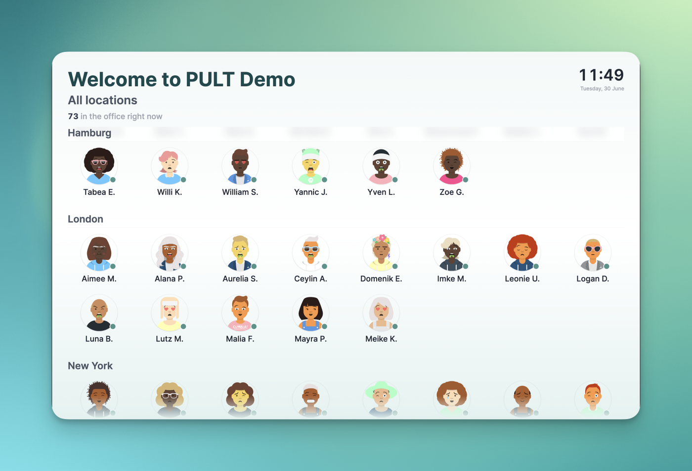
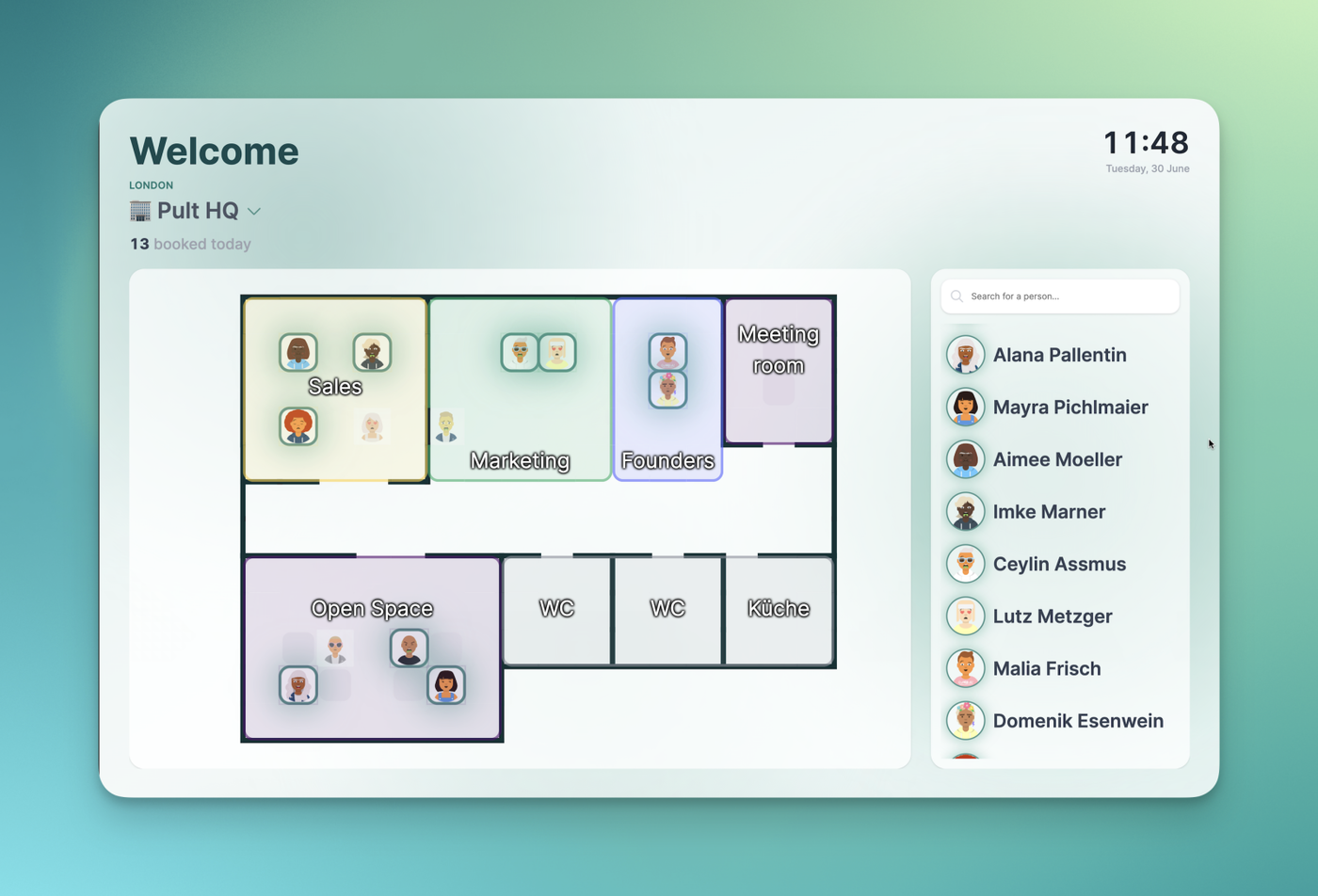
See who's in the office at a glance with Presence TV Mode. You can now display a live office board on any TV or large screen, showing the floorplan and the people who are booked or present for the day. It updates automatically so shared screens stay current throughout the day. Access it from Dashboard → Desks → TV Mode.
Specific Office Overview
All Offices Overview