Jul 14, 2026
Jul 14, 2026
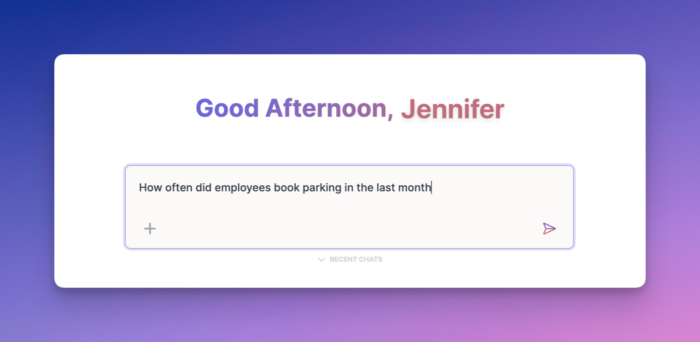
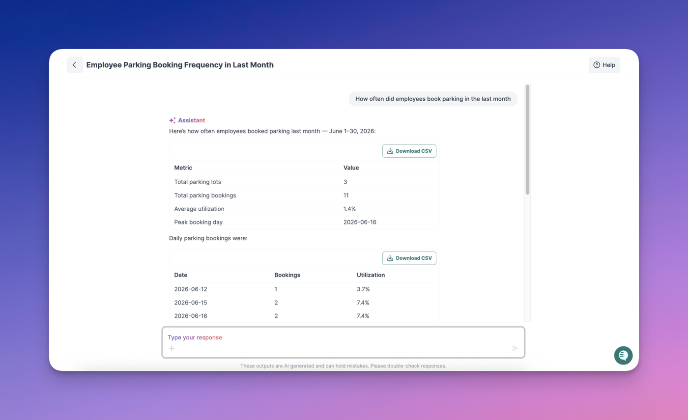
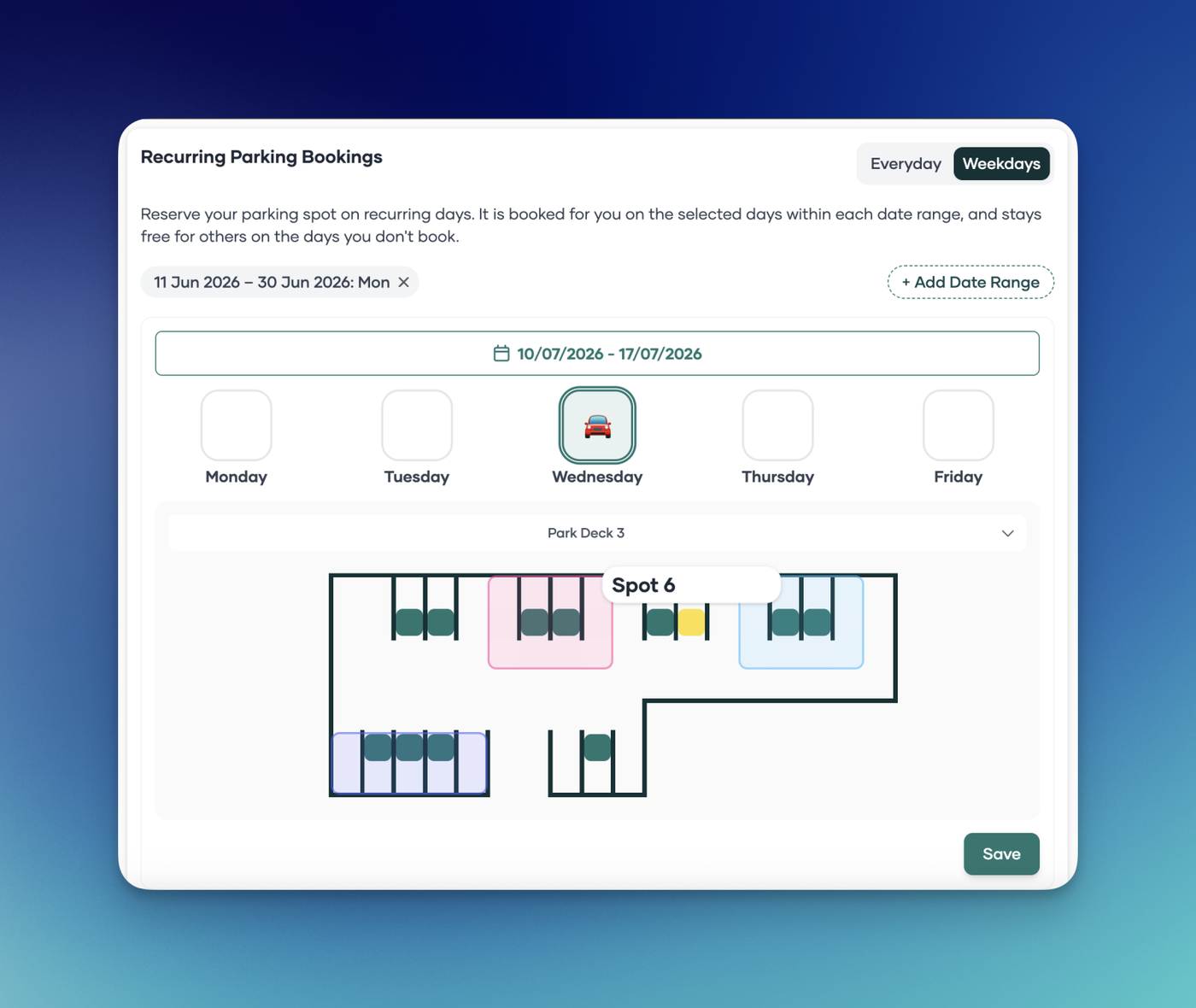
The PULT AI assistant can now display parking utilization data when asked. Previously, customers with active parking lots could not get parking usage insights through the AI assistant. This has been fixed — you can now ask the AI assistant questions about your parking space utilization and get accurate answers.