New Feature
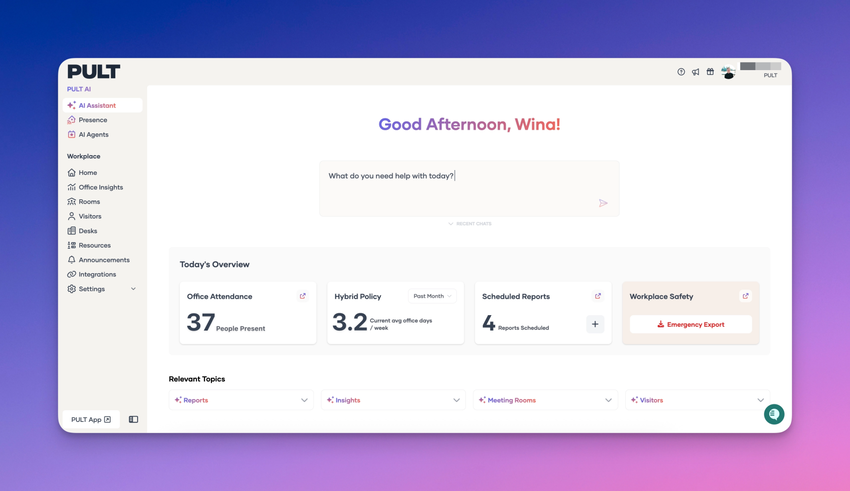
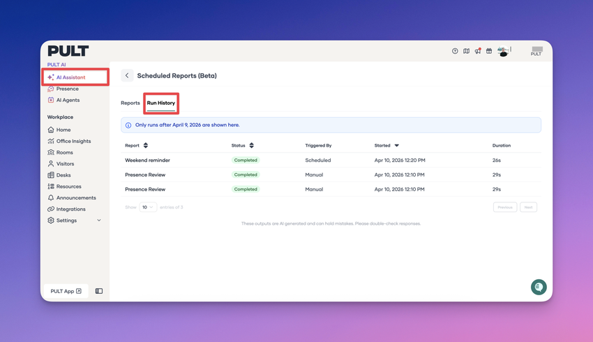
The PULT AI Assistant has been expanded to support meeting room data. You can now ask questions and get information about meeting room bookings, along with access to related insights and statistics. This update makes it easier to understand room usage, review booking activity, and surface key trends—all directly through the AI Assistant.

You can now export visitor information for a selected time frame using our new AI-powered export flow. Simply choose your desired date range and click Export with AI. You’ll be redirected to the PULT AI Assistant, where the relevant visitor data is automatically gathered and prepared. Once complete, the data can be downloaded as a CSV file for easy analysis and reporting.
The exported CSV includes the following columns:
- Date
- Guest Name
- Guest Email
- Host Name
- Host Email
- Status
- Check-In Time
- Check-Out Time
- Expected Arrival
This update makes it faster and more flexible to access detailed visitor data whenever you need it.

We’ve added an AI Assistant to the Dashboard to help you quickly gain insights from your workplace data—using simple, natural language questions.
Examples of what you can ask
- Today’s employee bookings
- How many guests did not check out
- The ratio between booked desks and actual check-ins
- Office capacity usage over the past month, broken down by office
- and many more...
The AI Assistant accesses system data only, meaning information that is available within Pult. Just type your question, and the AI Assistant will analyze the available data and return clear, actionable insights—no manual reports or exports required.

We’re excited to announce that PULT’s public roadmap is now live on Canny 🎉
You can now:
- 🗺️ View what we’re working on, what’s coming next, and what’s already shipped
- đź’¬ Share feedback and leave comments on ideas and features
- 👍 Vote on features to help us prioritise what matters most to you
You can find the roadmap anytime directly from the top navigation bar in your dashboard, making it quick and easy to stay up to date or share your thoughts.
Your input directly shapes PULT’s future—jump in and let us know what you’d love to see next!


PULT now automates meeting room check-ins using presence data or manual confirmations. If attendees don’t show up within a set grace period, the system automatically releases the room so others can book it. This update helps reduce wasted space, improves room availability, and ensures meeting rooms are used more efficiently.
Here are the highlights:
- Attendance is auto-checked based on configured rules like presence threshold, check times, meeting duration, and reminders.
- Manual confirmation is supported, allowing organisers to confirm via Slack, Teams, or Google Chat.
- Only the room booking is removed, never the meeting itself.
- Rooms are automatically freed if the meeting stays unconfirmed and attendance never meets the required threshold.
Restrictions for this feature can be configured in the Meeting Room Confirmation Settings. Full setup details are available in the PULT Help Center. We’d love to hear your feedback on this new feature!


We’ve added a powerful new heatmap to Office Insights, giving users a clear, visual understanding of how desks are being used across the office. When an office is selected, its floorplan now highlights each desk in varying shades of red, indicating how frequently it was booked during the chosen date range. A colour legend helps users quickly interpret utilisation levels at a glance.
Users can also hover over or click any desk to see detailed insights, including its usage percentage, number of booked days, and the exact date range—calculated using working days only. The heatmap automatically updates whenever the main date filter is adjusted.”

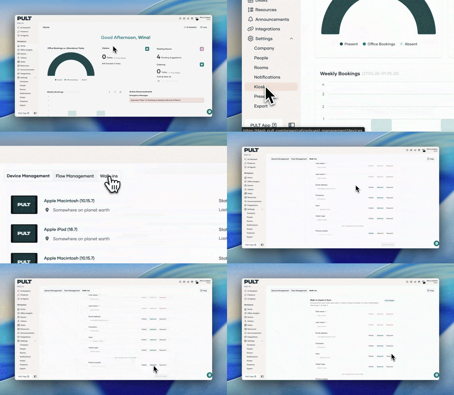
We’ve released a major update to the PULT Dashboard Home page, delivering a clearer, more actionable overview for administrators. This update introduces several new visualisations and improvements designed to streamline daily monitoring and decision-making.
✨ What’s New
1. Office Bookings vs. Attendance Today
- A revamped graph now displays today’s office bookings, presence detection/Check-ins, and absences (vacation or sick leave) sourced from your integrated HRIS.
- Hover interactions reveal exact numbers for each data point.
2. Visitors Overview
-
A new Visitors section summarises:
- Visitors arriving today
- Expected visitors this week
- Includes a fast-action option to check in the next arriving visitor.
3. Meeting Rooms & Catering
-
Meeting Rooms
- Shows the number of pending suggestions from the scheduling agent.
- Includes a quick-access button to navigate directly to the scheduling page.
- If no catering data is available, the next pending suggestion is displayed here.
-
Catering
- Displays how many meetings require catering today and this week.
- Includes a shortcut button to the catering management page.
4. Weekly Bookings Graph
-
Provides a clear weekly breakdown of:
- Bookings + actual check-ins for past days
- Default + planned bookings for upcoming days
- Hovering shows exact values and office capacity for better context.
5. Active Announcements
- Highlights currently active emergency or general announcements.
- If none are active, upcoming announcements are displayed instead.
- Includes a button linking to the announcements management page.

Familiar Tables
-
The bottom of the page includes the:
- Office Usage Today table
- Usage Details Today table
- These continue to provide employee-level insights on bookings and attendance.

We’ve added a new indicator to the calendar to make it easier to see when a check-in occurred on a specific day:
-
Check-In Detection
The calendar now displays an indicator whenever a check-in—manual or presence-based—has been recorded for that day. -
Timestamp Visibility
Hovering or clicking on the day in the calendar will show the exact timestamp of the check-in.

We’ve introduced several new features to the Presence Average Attendance graph to improve usability and ensure data is shown appropriately based on permissions:
-
Custom Timeframes
Users can now select custom timeframes for viewing average attendance. -
Team Average Attendance Display
When filtering by team, the graph now shows the team’s average attendance for better group-level insights. -
Permission-Based Employee Visibility
If permissions restrict access to individual employee data, the graph will automatically hide individual average attendance and display only the team average. -
Location Filter Added
You can now filter the graph by location, allowing clearer comparison across different sites.
1. Custom Timeframes

2. Team Average Attendance Display

3. Permission-Based Employee Visibility

4. Location Filter Added